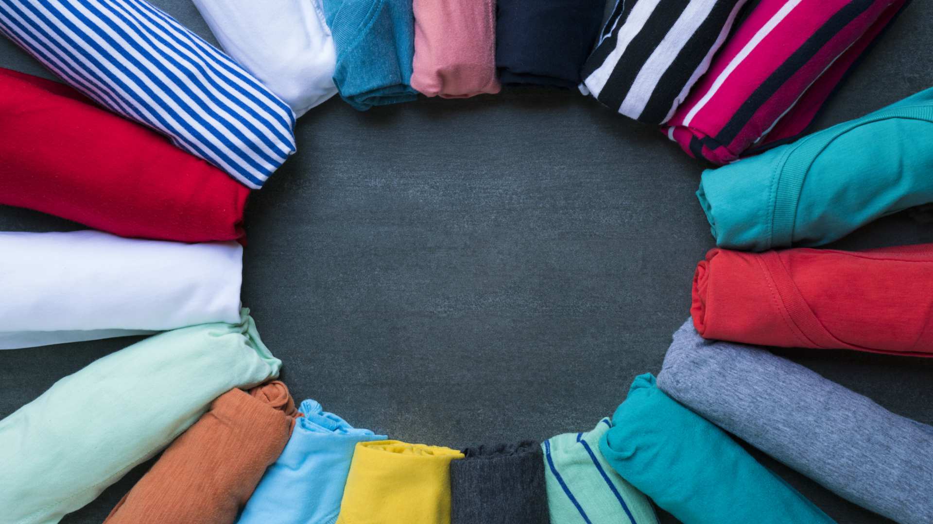
If you design t-shirts for a business or fundraiser, you want your designs to stand out. A vital part of a great design is the right color combination, but color theory can get confusing fast. In this post, I will compare the 26 best t-shirt color combinations based on my research, as well as my own experience printing t-shirts over the years.
When designing color combinations, try going for classic neutrals, analogous colors (those that group together on the color wheel, like blue and purple), monochromatic schemes (like two blues), or a pairing between red, blue, or green with yellow or white for maximum pop.
Using complementary colors (those opposite each other on the color wheel, like blue and orange, gives a combination with possibly too much pop. Use these with caution.
Be aware that dark inks may muddy on dark shirts and that light prints may require an outline of a dark color to prevent detail from disappearing on lighter grounds. Aim for contrast in tone: light on dark or dark on light. Let’s have a look at the 26 best t-shirt color combinations:
1. Black And White
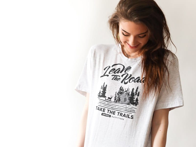
A timeless combination, black and white, has the potential to be anything from stylish and classy to edgy and grungy, depending on your design. Whether you go for a black design on white or a white design on black, you will have a design with excellent contrast.
These colors have broad appeal and can be worn with anything, so the combination remains enduringly popular. The only downside is that it is ubiquitous, so you need a great design to make it stand out.
2. Black And Gray
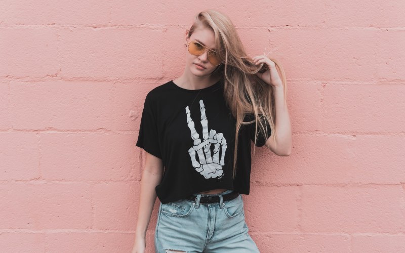
Black text on a light or mid-gray t-shirt is a stylish combination with more edgy appeal despite having less pop than black with white. It has the same advantage of being neutral and going well with various wardrobes as black and white does while carrying the design more.
You can team dark gray with black. Whether you do a black design on a charcoal t-shirt or dark gray ink on a black t-shirt, you will have a stylish and mysterious black-on-black effect.
3. White And Gray
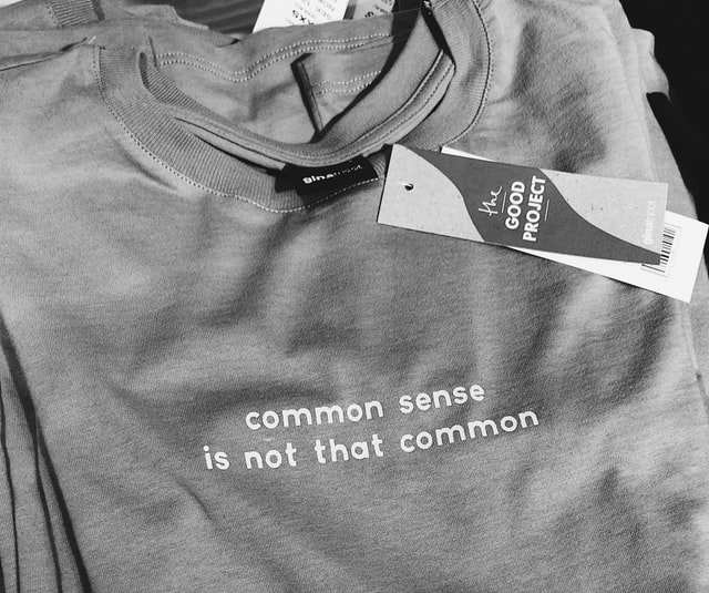
White and gray have been used to significant effect by Apple to create a neutral, sleek, and stylish product. Team a dark gray t-shirt with a white design, or a dark gray design on a crisp white t-shirt, for a beautifully sophisticated combination that goes well with any wardrobe.
4. Black And Yellow
Black and yellow is a high-contrast combination that can look great for a t-shirt, especially when done as a yellow design on a black t-shirt. If you are doing it the other way around, remember that yellow is a less-popular color for t-shirts, though mustard is on-trend.
For a touch of glamour, go for a metallic gold print on a black t-shirt.
5. Yellow And Off-White
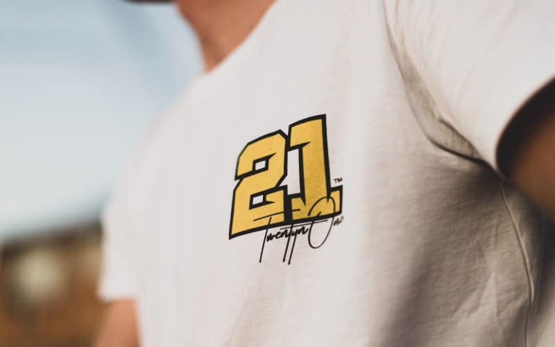
Yellow and white are both light, bright colors, so they usually don’t work together. However, if you tone the yellow of the design down a bit and use an off-white t-shirt, you can create a lovely retro look. Use this for a seventies-inspired t-shirt.
6. Dark Blue And Light Blue
An example of a monochromatic color scheme, the combination of dark blue and light blue plays with the world’s most popular color for an understated but stylish effect.
Pair a dark blue print with a baby blue t-shirt, or reverse the effect with a frosty light blue on a navy background. You can even add a third blue, provided you keep enough contrast between them.
7. Blue And Gray
This combo has something of the same appeal as blue on blue due to the cool effect of pure gray. You can do this combo with a light gray on a navy blue or a dark blue design on a light or mid-gray t-shirt.
This combination is classic and widely popular. For a variation, try a warm gray (slightly brownish one) on blue, or use a navy print on a warm neutral t-shirt in a tone such as stone.
8. Purple And Blue
Purple is a trending color, with shades such as mauve and lilac known as millennium purple. Purple has connotations of royalty, wisdom, and mysticism.
Pair a deep purple design with a relatively light blue t-shirt or a light purple with a royal blue or navy t-shirt for a rich monochromatic/analogous combination. For a more feminine, whimsical combo, put a blue design on a purple t-shirt.
9. Blue And White
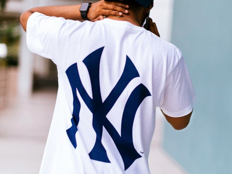
This classic, crisp combo can have a similar contrasting effect to black and white if the blue is dark enough. A navy t-shirt with a white design, or a white t-shirt with a navy design, is a similar neutral but with more energy than black and white.
A lighter blue with white gives a similar effect to blue and gray, but with more pop.
10. Blue And Yellow
Blue isn’t the world’s most popular color for no reason. It is a calming color with connotations of reliability and trustworthiness. Yellow, on the other hand, is seen as a vibrant, happy, youthful color.
Pair a design in a light yellow like canary, or a darker one like mustard, with a mid to dark blue t-shirt. Avoid using yellow on light blue unless you outline the design to make it stand out. For a sophisticated and timeless variation, pair a metallic gold print with a blue t-shirt.
11. Red And Orange
Red is a color of energy and passion, and paired with the more relaxed and friendly orange, you get an analogous color scheme that warms things up. A t-shirt in this color scheme will stand out in anyone’s outfit.
For a tricolor variation, try red, orange, and yellow. This energetic and sunny mix gives off summer and desert vibes and would be great for a t-shirt with such themes.
12. Red And Maroon
You will have a fantastic monochromatic color combination if you put a light red design on a maroon t-shirt or a maroon print on a light red t-shirt. This combo is high-energy, but the subtlety of the red and maroon makes it sophisticated.
13. Pink And Light Pink
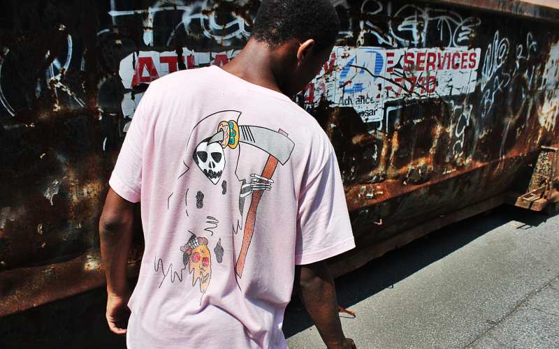
With pink a trending color among millennials (millennial pink), you can create an intriguing and feminine monochromatic combination by using two pinks.
Put a light pink design on a deep pink like fuchsia for a dramatic and sporty look, or a darker pink on a baby pink t-shirt for a more restrained look.
14. Red And Yellow
This combination is bright and cheery, and vibrant. However, we can’t recommend red on a yellow t-shirt: your design won’t show up well. The exception is if you use a dark red on a mustard yellow.
The reverse (mustard on dark red) gives a classic prep school look, or for a more dramatic variation, try metallic gold on red.
15. Red And White
Like black and white and blue and white, this color combo is high contrast. Whether you put a red design on a white t-shirt or a white design on a red t-shirt, you will get vivid contrast.
However, because of the different effect a white t-shirt has in an outfit versus a red t-shirt, which way round you do these colors will influence who the t-shirt appeals to.
Your customers could wear a red print on white with a monochrome outfit for subtle color. The reverse is a bold statement.
16. Maroon And White
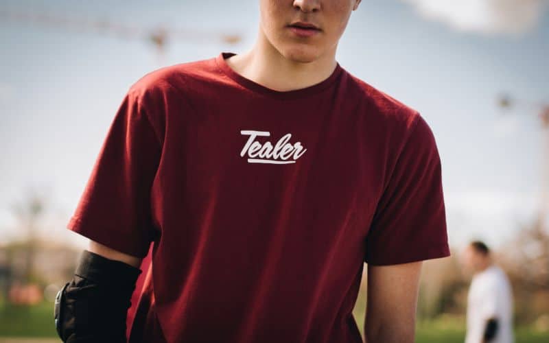
This combination is mainly suited to white print on maroon shirts. This combination pops, with the dark of the maroon allowing even fine detail of the white design to show up.
Maroon and the closely-related color burgundy have considerable appeal to the wealthiest demographic, making this color combination a good choice for a premium t-shirt.
17. Beige And Maroon
A beige t-shirt with a maroon design has a distinct, vintage look. As a result, it isn’t suitable for your cutting-edge designs, but if you are doing retro designs with a classic serif font, it could be ideal, giving that old-school, low-key vibe.
18. Green And Gray
This combination only works with green printed on gray. Do it the other way around, and the green tends to overwhelm the gray print. Don’t let that fool you, though: green on gray is stunningly effective, whether you go for a bright kelly green, lime, forest green, or olive.
Play around with different shades of gray and green to get the optimal combination. You want a good contrast between either a bright, light green and a dark gray such as charcoal or a darker, earthier green and a lighter gray.
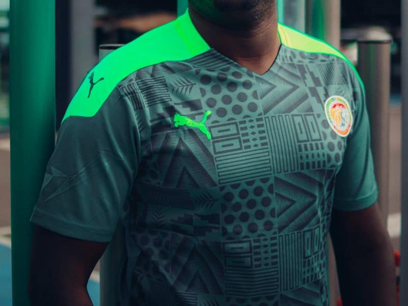
19. Green And Green
Like combining different shades of blue, different shades of green can make an effective t-shirt. Use a dark green with light green, and maybe even a mid-green, too, for a soothing, calming effect.
Green is a color associated with the outdoors and environmental causes, and such a color scheme would be a good choice if you are aiming at this market.
20. Green And Yellow
Green has a calming effect and associations with the environment. It has also recently become popular as part of the cottagecore aesthetic. Pair a laidback green t-shirt with a cheerful bright yellow print for a compelling combination.
We do not recommend doing this combination the other way around. You can play around with the greens and yellows: an acid yellow print on a lime green t-shirt gives an entirely different (psychedelic, analogous) effect to a canary yellow print on a forest green t-shirt.
Try putting metallic gold on forest green for a classy and premium effect. Or, for more of a safari/military vibe that is popular with women, try metallic gold print on olive green. This combination is a tried-and-true outfit classic but has an air of novelty on a t-shirt.
21. Green And White
The combination of green and white has even better contrast than red with white but has a calming effect more like blue and white. You will have a soothing yet high contrast combination whether you do white on green or green on white.
But bear in mind that the overall effect of white on a green t-shirt is different than green on a white t-shirt, especially depending on which green you use.
We do not recommend you go too light or bright with the green, as you will lose some of the contrast. A dark green that is almost black gives an interesting neutral effect and high contrast with the soothing nature of green, whereas kelly green and white will be vibrant.
22. Orange And Blue
We are getting into the complementary color combinations, starting with the most contrasting of the lot, orange and blue. This combination is highly potent, and it’s easy to overdo it, especially the orange. A bright, light blue like teal is also probably a misstep.
Try toning this combination down for an effective t-shirt. A muted orange shirt with a navy print can work. Alternatively, try a dark blue t-shirt with a yellowish- or reddish-orange in small amounts as an accent color (or use both for a split complementary scheme).
23. Green And Red
Another complementary color combination, red and green, has strong festive connotations and would best suit a winter holiday t-shirt, especially if you include any white.
This combination probably won’t work for a summer t-shirt unless you tone the colors down to an earthy green and brownish-red. Alternatively, try forest green and maroon for a preppy look.
A variation of green and red that has received notice recently for t-shirts is forest green and pink. Pink is sufficiently different from red to get away from the festive effect, and the soothing green and vibrant pink make a pleasing and effective combination with plenty of contrast.
24. Purple And Yellow
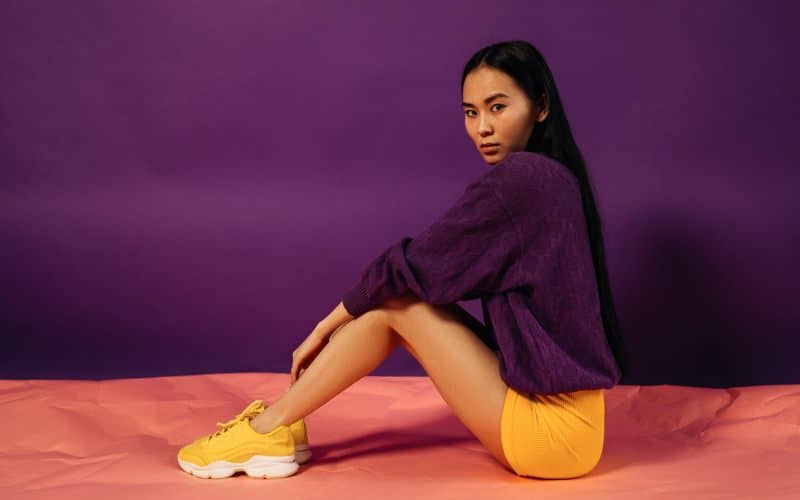
Purple and yellow work for the LA Lakers, but unless you are going for a tribute to this team, you will have to vary your design and your colors sufficiently to make it look different. Try a light canary yellow print with a rich purple t-shirt, or reverse the combination.
The third complementary combination, this pairing matches mysterious, luxurious purple with cheerful yellow for an exotic, mystical, and yet classic effect. Use metallic gold with a deep purple or wine purple to amp up the luxury.
25. Red, White, And Blue
This color combination might seem like it would only be appropriate for patriotic flag designs. In fact, it is a highly versatile combination that allows you to combine the powerful colors red and blue with the assistance of neutral white.
You can put this combo together in various ways, from red and blue prints on a white t-shirt to a red image with white borders on a blue t-shirt, a white print on a blue t-shirt with small amounts of red as an accent, or a white print on a red shirt with blue accents.
Vary the intensities of the red and the blue to maintain strong contrast, and there are countless effects that you can achieve with this combination.
26. Red, Blue, And Yellow
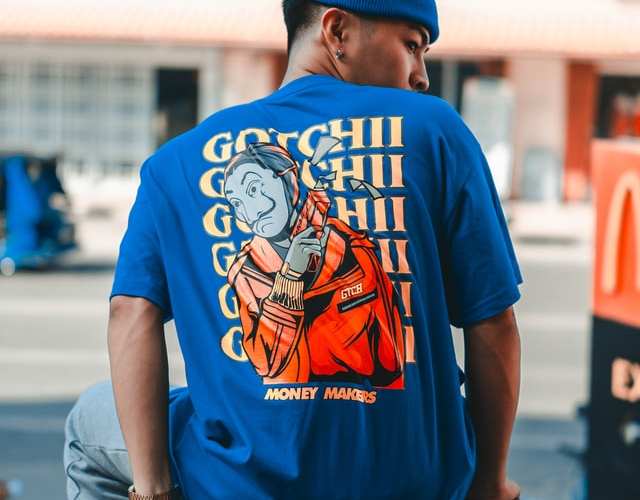
Using all three primary colors together on a t-shirt is something to do with caution if you do not want a design that looks like an elementary school lesson. Nevertheless, we have included it here because this combination can be powerful if you use it correctly.
You will want to alter the tonality of two of the colors away from their pure form to make this combination work. Try putting a pure yellow with a navy blue on an orange-red, or a mustard yellow and a frosty grayish blue with a vivid pure red, for example.
A third possibility, an orange-yellow and orange-red on a pure blue, harks back to the split complementary combo discussed under orange and blue.
As with other color combinations, one of the keys to making this effective is to have sufficient variation in tone (light/dark) to create an exciting contrast that makes your design stand out.
Conclusion
There are so many possible color combinations you could choose for a t-shirt, and not all of them will work well. Use one of the combinations described in this post to make your design pop.
After all, we live in a world of color, and effective color use on your t-shirts can help you stand out from your competitors.
Bryan E. Robinson is the former owner of TshirtGrowth. He has sold t-shirts since 2006 through dropshipping, screen printing, vinyl printing, DTG, Print on Demand, and more. Bryan has created his own t-shirt designs through Photoshop, Canva, and other platforms, as well as worked with freelancers to create many of his designs. Besides t-shirts, Bryan has over 18 years of experience in online marketing with eCommerce, B2B SaaS, B2C products, and more.

