One of the most important – and sometimes most difficult parts of owning a small t-shirt printing business is coming up with unique designs. It is even more tricky when you involve elements like lettering. If you’re having a hard time picking the best t-shirt lettering size for your designs, have no fear!
The optimal t-shirt lettering size for your designs is dependent on the design itself and the size of the shirt. The lettering should fit within specific design dimensions. Your lettering size is also affected by several different factors, including composition, legibility, and style.
There is no one set size that will work for every shirt when it comes to lettering. Our comprehensive guide on lettering and how it factors into your design will help you find what works best for you and create great, high-quality shirts that will have your customers coming back time and time again.
Best T-shirt Lettering Size For Your T-Shirt Designs
When it comes to designing your t-shirts for your small business or apparel line, learning how to size your overall design can be difficult.
It can be even more tricky when you incorporate fonts or lettering because you need to walk the balance between keeping your design clean and making sure that any words or phrases included in your design are clear and legible without being too big or too small.
Of course, there is no ideal lettering size for t-shirt designs. This is because your design could only include your lettering, or it can be part of a larger design that includes graphics and other design elements. The best font size for t-shirts can vary, based on other elements of your design such as vectors. Emphasis on specific words can also make the font size vary from one word to the other.
The font size for shirts you are printing on can also affect how big your font will be. A youth small shirt will need a smaller design as compared to an XXL shirt.
What is the Standard Text Width on a T-shirt?
The standard width of the text on an Adult Large unisex shirt is between 9 and 12 inches. If you go over 12 inches, it’s almost always too large on a shirt. To get an idea of the width and height of shirt lettering, we advise you to carry a cloth measuring tape with you next time you go to a retail store. Measure a few designs and you can get a good of the size and how that actually looks on the t-shirt.
For example, you may make a shirt with a phrase like “Surf’s Up!” in the middle of the chest area. You could also use the same phrase in a larger design that incorporates an image of a surfboard or the ocean. In each case, your choice of font size will differ.
You may also have a design that only focuses on certain words or phrases that vary in font style and size. For instance, a phrase like “Don’t Worry, Be Happy” could have the words “Don’t Worry” written in a smaller, simpler font, while the second half of the phrase is written in a more decorative font in a larger size.
When you consider that some fonts are better for smaller sizing and others are more well-suited to larger font sizes, finding the ideal lettering size becomes much more complicated. Instead, you can use specific, standard design sizes for each shirt and fit your lettering within those dimensions.
How To Pick The Best T-Shirt Lettering
A few factors are involved when choosing the right lettering for your designs. These factors include legibility, style, compatibility with your overall design, compatibility with other fonts, emphasis, composition, and the number of fonts you use.
Make Sure Your Lettering Is Legible
When it comes to lettering, there’s no point in incorporating it into your design if you can’t read it!
You should always pick a font with clean lines that are thick enough to define each letter but not so thick as to obscure them. The lettering will fade into the shirt’s background if your lines are too thin. But if they are too thick, your letters will end up looking like unrecognizable blobs.
Whichever font you choose, it should be legible to someone at least an arm’s length away from whoever is wearing the shirt.
Don’t Be Afraid To Give Your Lettering Some Style
Choosing a legible font doesn’t mean using the most boring fonts you can find! Using decorative fonts can be a fun way to add personality to your design.
It’s important to note, though, that decorative or cursive lettering can be harder to read. This means that you need to limit the number of words within your design that use a decorative font. They can be a great way to emphasize a word or two, but if you use too much of it, your design will look messy and lose a lot of its legibility.
Make Sure Your Design And Lettering Are Compatible
When you’re choosing your font for your lettering, you should make sure that it matches the subject of the t-shirt. After all, you wouldn’t use Comic Sans when you’re printing a batch of company t-shirts!
Having a unique font can be a great way to have your shirts stand out but try to avoid using fonts that don’t match the overall tone of the shirt.
You should also try to match your lettering to your design. Having a spooky font design with a graphic of a puppy wouldn’t make very much sense, so remember that your fonts have the ability to affect the look of your final product.
Choose Compatible Lettering
While this may seem similar to our last point, making sure that your lettering is compatible with other fonts that you use is extremely important.
For example, you may want to use two different fonts in your design. In that case, you need to make sure that your fonts follow the same aesthetic as your design.
As we’ve mentioned, using a decorative font to create emphasis is a great way to inject some personality into your shirt. But you wouldn’t want it to feel out of place with any of the other fonts that you have used.
Think about how strange it would look to use this font with something like this. Picking compatible fonts could be the difference between making your design look drab and making it look fab!
What is the Best Place to get Free Fonts for T-shirts?
We love using DaFont.com for our own t-shirts. This is one of the best free font websites online. Our 2nd favorite is FontSquirrel.
These sites are fantastic for fonts. Another option for unique web fonts is Creative Market. While not free, you can get licenses for amazing fonts on Creative Market.
Use Your Lettering To Create Emphasis
Part of making your lettering stand out as part of your design is emphasizing certain words using a visual hierarchy. This means that you will need to order your text in such a way that you can bring attention to certain parts of your lettering.
Using fonts of differing sizes, decorative fonts, or changing the color of some of the lettering can help pull the viewer’s eye to the most important parts of the shirt.
For example, ordering a phrase like “Coffee Makes The World Go ‘Round” would suggest that the subject of your text is coffee. In that case, you would enlarge the word ‘coffee’ and use a smaller font size for the rest of the lettering so that your subject catches the viewer’s eye.
Lettering Can Change Design Composition

When you’re coming up with t-shirt ideas, you want to try to fit your entire design onto the shirt. But that means that you will need to fit your design within specific dimensions so that your design looks clean and high-end on your final product.
The composition of your design can make or break your product, so you need to make sure that your design isn’t too busy or overcrowded. Too much text can make your shirt look sloppy and poorly thought out.
When you are using text within your design, you should always try to make it short and to the point. A popular phrase like “It’s a good day to have a good day” is a great idea for a shirt – but only in theory.
If you try to apply a phrase like this to your shirt, it can make your shirt look messy and will be too long to be legible when it is worn. Instead, using only part of the phrase, like “It’s a good day,” would give you more freedom to add a graphic or keep your shirt simple and your design crisp.
When it comes to t-shirt designs that utilize text, less is definitely more. Try to keep your lettering to a few words or a short quote or phrase.
Keep Your Lettering Choices To A Minimum

So, what do we mean by ‘lettering choices?’ Well, we’re talking about using different lettering styles or fonts. There’s a fine line between using fonts to keep your shirts fun and interesting and having a shirt that is overly complicated and hard to read.
When you lay out your lettering for your text, you’ll want to keep your font choices to a minimum. That means choosing around two of your favorite fonts and using them in your final design. Just remember to make sure that your fonts are compatible!
If you use more than two types of fonts, your design will be difficult to follow and will end up looking messy and inexpensive. After all, it’s difficult to read a sentence that is made up of five different fonts!
By keeping your designs simple and stylish, you’ll be able to appeal to a wider customer base.
T-Shirt Design Sizes
By having a list of your t-shirt sizes on hand, fitting your lettering within these specifications becomes much more manageable. Of course, something that you should always keep in mind is that no two shirts will be the same.
The size of your shirts, and subsequently your designs, will primarily be based on your t-shirt supplier and can vary from brand to brand.
Before choosing your design size, you will need to measure your shirts to get a better idea of where you should place your design. You will typically want to leave a two-inch gap below the collar so that your design sits in the center of the chest or back area of the shirt.
Similar to the width of each shirt, your t-shirts can also vary in length. Ideally, you will want your design to end well above the bottom hem of your shirt, so be sure to leave some blank space at the bottom of the shirt.
You can also print your lettering down the sleeve of your shirt if you are printing on a long-sleeved t-shirt. This will limit you to a specific word or short phrase because the lettering will look best when centered on the shirt’s forearm area.
Be sure to leave a small gap between the cuff of the sleeve, though, or your font may become illegible.
There are a few different areas that are ideal for design placement on a t-shirt. These include the chest, the back, and the sleeve of your shirt if you plan to design long-sleeved shirts.
You could also print on the pocket area of the shirt. Still, your lettering will be limited to a short word in the center of the pocket, or – if you offer t-shirt personalization – your customer’s or businesses’ initials.
Because the most common areas for printing are the front and back of t-shirts, we’ve put together a short guide on standard t-shirt sizes, as well as their width and the maximum width that your design should be based on these factors.
It’s important to note that this is just a guide, and your design sizes should be based on your measurements of the specific t-shirts you will be printing on.
When measuring your shirts, be sure to leave at least 4 inches on either side of the design. This will ensure that your design is visible and legible when the shirt is worn.
| T-Shirt Size | Estimated Width | Maximum Design Width |
| Adult Small | 18” | 10.5” |
| Adult Medium | 20” | 11” |
| Adult Large | 22” | 11.5” |
| Adult Extra Large | 24” | 12” |
| Adult 2XL | 26” | 13.5” |
| Adult 3XL | 28” | 14” |
| Youth Extra Small | 16” | 9.5” |
| Youth Small | 17” | 10” |
| Youth Medium | 18” | 10 – 10.5” |
| Youth Large | 19” | 10.5” |
| Youth Extra Large | 20” | 11” |
Cricut Font Size for Shirts
When using a Cricut machine to cut out letters or designs for t-shirts, these general size guidelines apply:
For adult shirts, letters around 2 inches high tend to work well, and the width can vary based on the length of the word or name, but usually about 8-12 inches across.
For children’s shirts, the letters should be proportionately smaller, around 1-1.5 inches high.
In terms of font size settings in Cricut Design Space, the software you use with your Cricut machine, there isn’t a direct correlation between the font size in Design Space and the actual size of the letters as they appear on a t-shirt. The size of your design as it appears on the Cricut Design Space canvas directly correlates to the actual size it will cut, no matter the “font size” you’ve set.
You will need to measure the design height and width manually with the Cricut Design Space tools to ensure it fits your needs. If you want a 2 inch high letter, adjust the height of your text box until it matches the desired size.
Letter Size For Back of Shirt

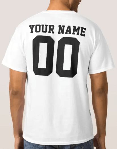
A common question I see is “What size should a name be on the back of a shirt?“. The size of a name on the back of a shirt often depends on the size of the shirt itself, the purpose or use of the shirt, and your personal preference. Generally, the following recommendations apply:
For adult shirts, a popular choice is approximately 2-2.5 inches high for each letter, with the name spanning roughly 8-12 inches across. This should make the name visible from a moderate distance.
For children’s shirts, the name should be proportionately smaller, around 1-1.5 inches in height.
For sports shirts, which are often designed to be seen from the stands, the names can be larger, around 2.5 to 3 inches in height.
Font sizes can vary for each sport, so if you are designing these for a sports team, you need to double-check with regulations before printing. In general, I like to follow this back of shirt font size chart for the back of sports shirts:
Soccer Shirts Font Size for Back of Shirt
| Soccer | Youth | Adult |
| Name | 2″ | 2.5″ |
| Back Number | 8″ | 8″ |
Football Shirts Font Size for Back of Shirt
| Football | Youth | Adult |
| Name | 2″ | 2.5″ |
| Back Number | 10″ | 10″ |
Baseball Shirts Font Size for Back of Shirt
| Baseball | Youth | Adult |
| Name | 2″ | 3″ |
| Back Number | 6″ | 8″ |
Hockey Shirts Font Size for Back of Shirt
| Hockey | Youth | Adult |
| Name | 2″ | 3″ |
| Back Number | 10″ | 10″ |
Basketball Shirts Font Size for Back of Shirt
| Basketball | Youth | Adult |
| Name | 2″ | 2.5″ |
| Back Number | 6″ | 8″ |
Lacrosse Shirts Font Size for Back of Shirt
| Lacrosse | Youth | Adult |
| Name | 2″ | 2.5″ |
| Back Number | 8″ | 10″ |
Volleyball Shirts Font Size for Back of Shirt
| Volleyball | Youth | Adult |
| Name | 2″ | 2.5″ |
| Back Number | 6″ | 8″ |
Remember, these are just recommendations and can vary based on the font and style you choose. Keep in mind that longer names will need to be decreased in size so they do not run off the shirt.
Conclusion
There is no right or wrong answer when picking the right font size for T Shirts. It all depends on the design that you have in mind and what looks good when you consider the overall composition of the shirt.
Now that you have a better understanding of what you’ll need to think about when choosing lettering for your designs, you’ll be able to choose lettering styles and sizes that work for you, your products, and your business as a whole.
Just remember, there is no one-size-fits-all lettering size, and the only limit to your designs is your creativity. So get your creative juices flowing and set yourself up for success!
FAQ
What size should font be on a shirt?
The size of the font on a shirt can vary based on other things in the design of the shirt graphic itself.
What size should a name be on the back of a shirt?
The name on the back of a shirt should be 2″ to 3″ tall. The longer the name, the smaller the font has to be.
How big should letters be on a shirt?
Letters on a shirt should be as big as needed to make the design itself look great on a shirt. Making it too small will not attract attention to the design itself.
Bryan E. Robinson is the former owner of TshirtGrowth. He has sold t-shirts since 2006 through dropshipping, screen printing, vinyl printing, DTG, Print on Demand, and more. Bryan has created his own t-shirt designs through Photoshop, Canva, and other platforms, as well as worked with freelancers to create many of his designs. Besides t-shirts, Bryan has over 18 years of experience in online marketing with eCommerce, B2B SaaS, B2C products, and more.


